photos by Richard Schumacher
We have all visited beautiful layouts boasting meticulous track, detailed motive power and rolling stock, hundreds of citizens, large swaths of beautiful trees, and lots of buildings. Somewhere along the line, you start to recognize some of the structures: Aunt Millie’s House, Speedy Andrew Repair Shop, the Walker Building, Cutting Scissors, Roberts Printing, etc.
Don’t get me wrong, these are all great kits. They are so great that nearly everyone has them. So what is a way to use these buildings, while rendering them anonymous?
Several attributes define the identity of a structure: size, shape, color, architectural details, and signage. By modifying one or more of these characteristics, you can individualize any structure.
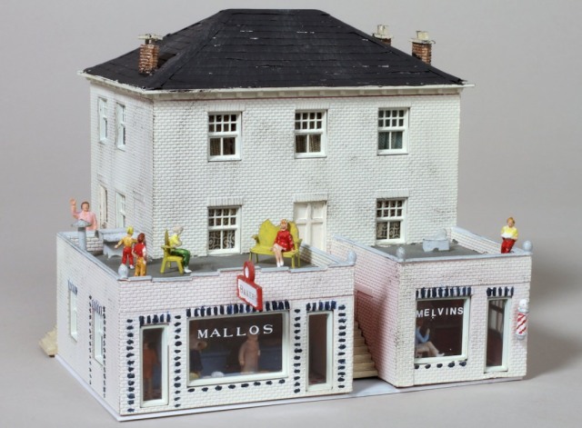
First, consider size. You can easily change the footprint of a building by adding a lean-to or dock to it. For example, I built 1600 W. Main St. from a pair of Dan’s Produce Markets. By laying out the building to go on a hill, and creating a home at the top fronted by a pair of storefronts on the street, this common commercial structure takes on a totally different character as well as following a prototype structure standing within a mile or two of my house.
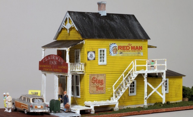
Another example of this is the Clairway Inn, which consists of stacked houses from Grant Line with the long lean-tos added in the back.
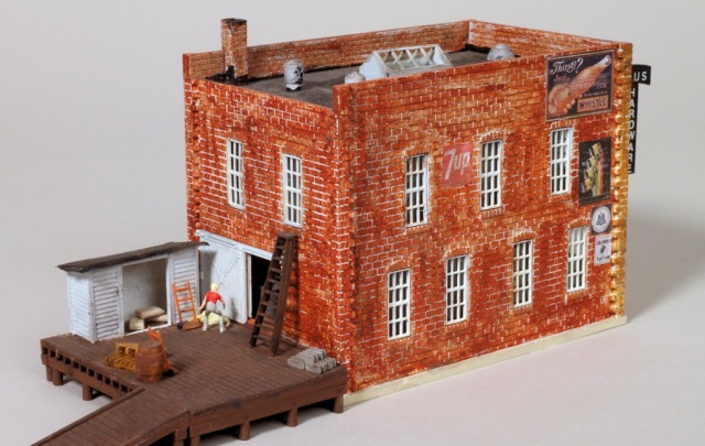
These two examples also change the shape of the building the kits were intended to create. Another way to change the shape is to add something to the structure. Haus Hardware presents a different look from the common business structure this part of Gruesome Casket is supposed to represent simply by adding a dock. Additionally, since the building nestles up to the backdrop, I transferred the bricked up windows from what would have been the far wall to the wall facing the aisle.
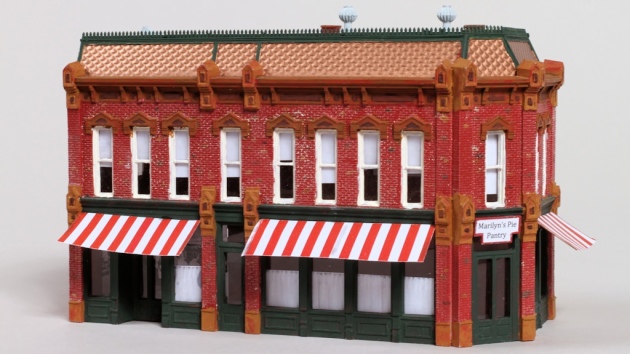
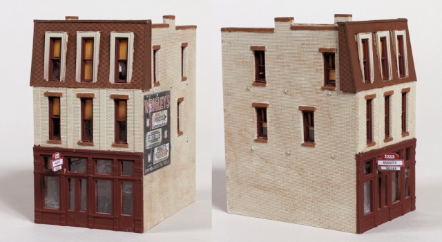
Taking the Design Preservations Walker Building as a starting point, I added a mansard trimming back the brick walls to the appropriate angle using Plastruct’s fish scale. I also added Tichy star-shaped nut-bolt-washer castings to the side wall following the common practice of bolting the walls of brick buildings together for stability.
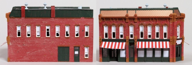
The Seymour Block, also by DPM, received a more ambitious mansard (using the same material) to become the Telephonic Exchange. I created the detailing on top of the mansard by cutting the tops off of Central Valley picket fencing.
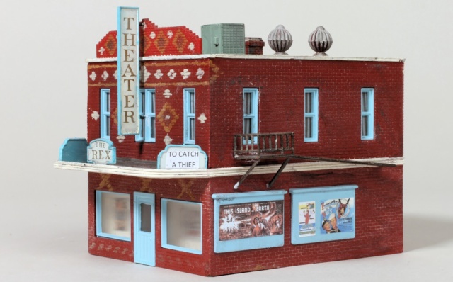
The Rex Theater began her life as Uncle Al’s United Grocery produced by Pola. The crown on the front of the building is from Dan’s Produce while the canopy was constructed using styrene sheet and shapes. I painted masonry details on the brick work. The front signage came from Walthers.
In each of these cases a common building transformed into something whose pedigree became a little less recognizable.

